Brand Transformation
Auckland Hockey wanted to reinvigorate their brand to signal a new era in the association’s 100-year history and reinstate the pride that had been associated with playing with Auckland in previous years.
Conversations with stakeholders and players (both past and present) were undertaken to distill the way to communicate Auckland Hockey’s heritage, energy and commitment.
The Idea: Beautiful Edge with Pure Dynamism
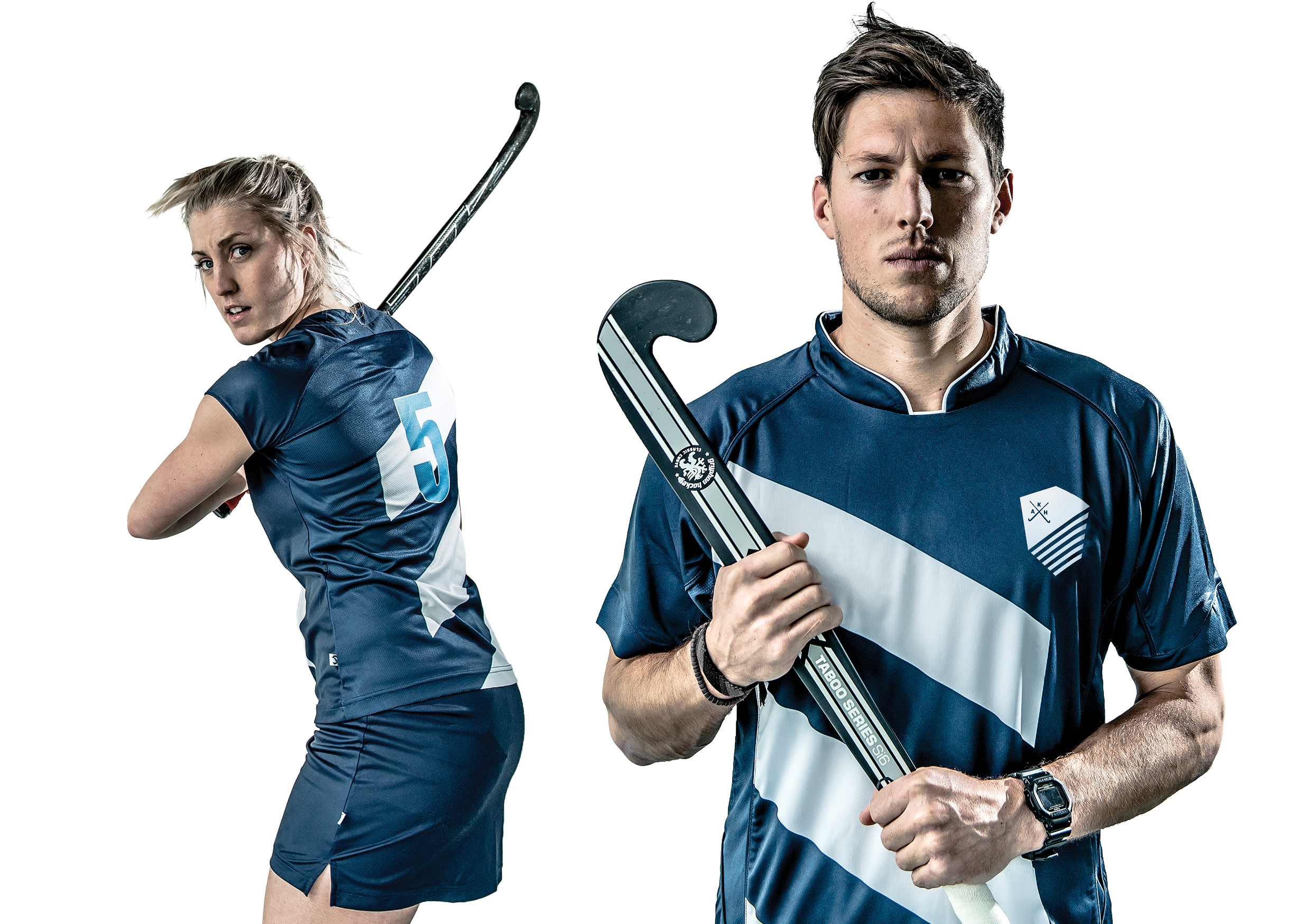
Using beautiful edge with pure dynamism as our idea the traditional horizontal Auckland stripes was evolved to be on a 35 degree angle. This became a visual metaphor for the new direction and edge Auckland has and formed the basis of the whole identity.
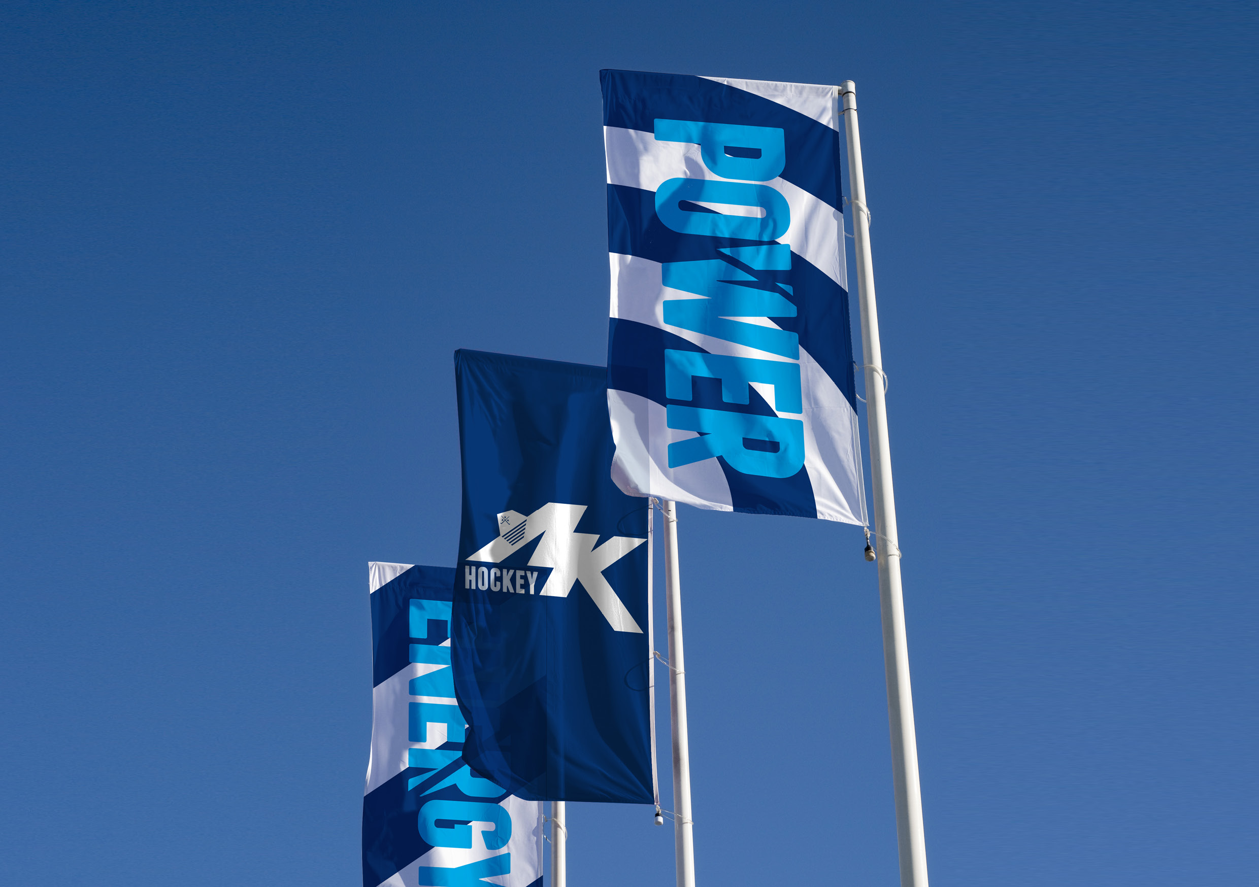
Strategically, two sides were created for the brand; ‘Auckland Association’, represented by a shield, versus ‘Game Day’, represented by a dynamic ‘A K’ mark.
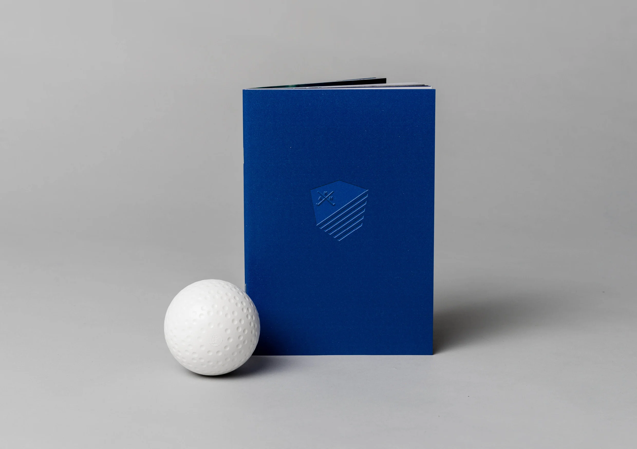
The Auckland Hockey Association shield was created to deliver the gravitas of a board making decisions on behalf of hockey in Auckland, whilst retaining this credibility internationally.
‘A K’ is the abbreviated dynamic mark used for Game Day and designed to create both emotion and interest in Auckland Hockey's marketing and merchandise. Again, based on the 35 degree angle, it can work in partnership with the shield, stripes or stand-alone.
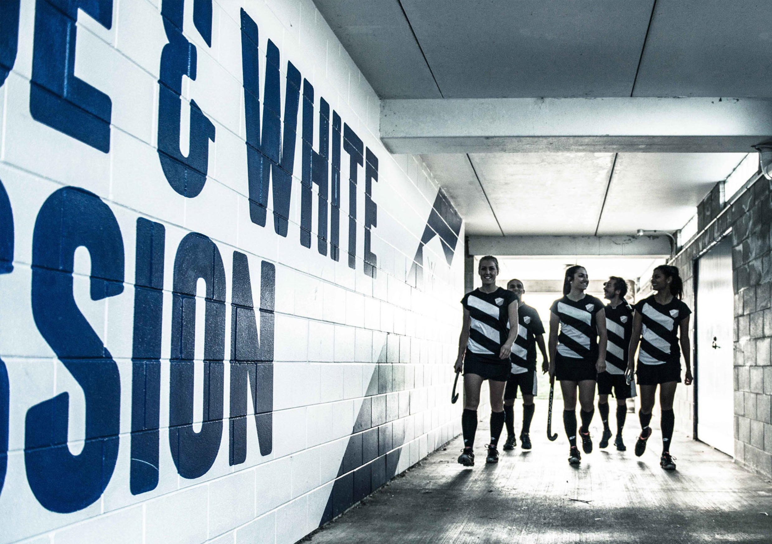
The style of imagery is always bold, dynamic and gritty supported by bold statements that are used aorundthe players changing rooms and the hockey field.
A players book was created to start a new ritual for new Auckland Hockey representatives. This book is handed to players with their uniform, creating a sense of pride and letting them know the exclusivity of the club they are entering into. Each book is individually numbered and contains the history and pride that makes Auckland the club it is today.
The new stripes have become the new signature for Auckland Hockey and a way of making them distinct from any other Auckland sport.
Created at Designworks with Jef Wong, Michael Barron, David Lyall and Mallika Goel.